
Peer2Peer Mobile App
2023
Fostering Student Connection and Mentorship
10 weeks
User Research
Interface Design
Competitive Analysis
Usability Testing
Research
Ideation
Design
Reflection
Figma
Miro
Google Forms
Project Timeline
Process
My role
Tools
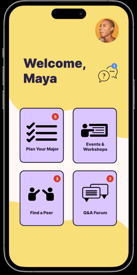
Peer2Peer is a mobile application that consolidates professional resources for university students while also providing a space to connect with peers and mentors. This project began in my User Centered Design class after my team and I began to reflect on our experiences and struggles as college students.
College students experience significant stress relating to applying for their major, figuring out what classes to take, and meeting people on campus who share similar career goals and interests. While there are resources that exist out there to support students, these resources are often scattered.
OVERVIEW
PROBLEM
THE SOLUTION
To address this problem, my team and I designed a mobile application that is a one-stop-shop style platform for planning for a major, signing up for professional opportunities, and asking peers for advice. Our solution emerged from weeks of user research and competitive analysis.
How might we make it easier for students to access professional and personal growth opportunities so that they feel supported in their college experience?
USER RESEARCH
I set up an initial survey to gather information about student experiences with the major application process and finding peers within their (intended) major. We heard back from 16 students from a variety of different majors.
SURVEYS
My team and I began conducting semi-structured user interviews to better learn about our problem space. As a team, we each conducted 4 interviews. Our goal was to interview students from different majors and academic pathways. We coded our interviews to identify common themes and pain points.
INTERVIEWS
Students feel stressed out about the process of figuring out what they should major in and how to strengthen their application.
Students feel overwhelmed by how scattered professional growth resources are across different departmental websites.
Students find it challenging to find friends or mentors who have similar career aspirations. Students who were applying for their majors didn't know many mentor figures already in the major. Additionally, students who were already in their major found it challenging to deepen connections outside of classes.
Interviewee, Sophomore at the University of Washington
Key Takeaways from Interviews:
“I feel frustrated because as a student, I know there are resources out there that can help me figure out what major I might be interested in pursuing but they don’t feel easily accessible and it’s overwhelming to have to do so much research...”

Organizing User Stories
To establish a clear vision, we worked on prioritizing user needs. The most important priorities were based on having a unified platform for resources and making it easy to navigate.
In the ideation phase, we began thinking about key features:
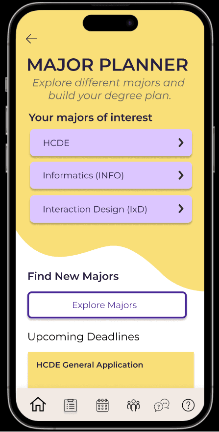
Major planning
Performing simultaneous degree audits to learn about different majors at the same time.
Events and Workshops
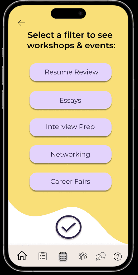
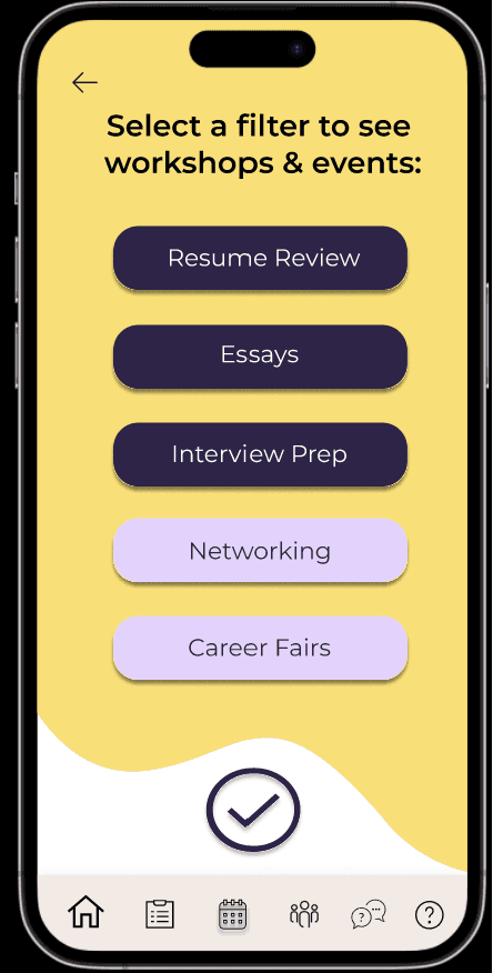
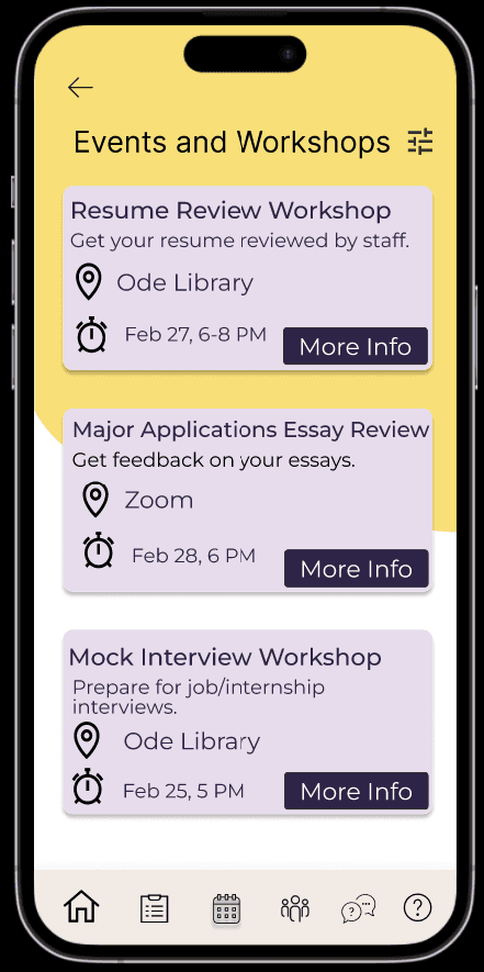
Discovering professional workshops on campus, filtering through them, and registering for them.
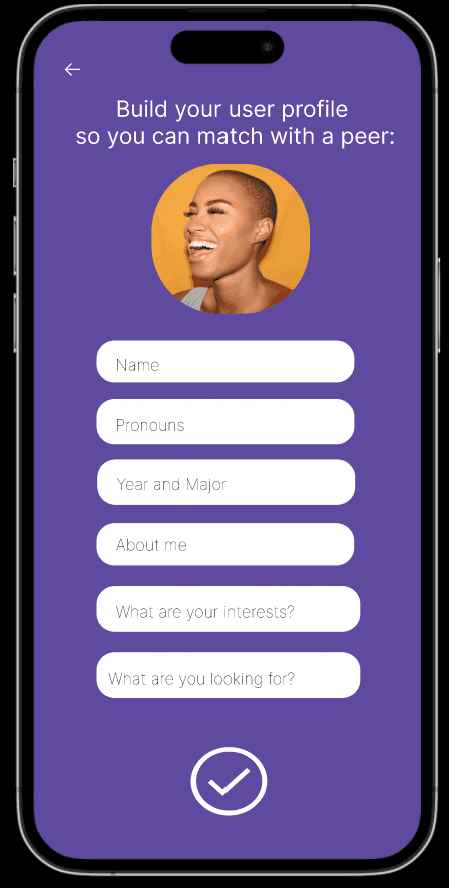
Peer to Peer Matching
Connecting with peers/mentors in a swipe-style format.
Q/A Forum
Asking peers questions.

Can we consolidate resources in a mobile application that is easy to navigate and multi-functional?
Initial Brainstorming
How do other platforms and apps compare?
The University of Washington’s Degree Audit Reporting System (DARS) only lets the student select one major at a time to learn about the coursework and graduation requirements. There is no way for a student to simultaneously compare different majors at once. We wanted our app to focus on a Venn-Diagram structure that would allow students to compare majors simultaneously.

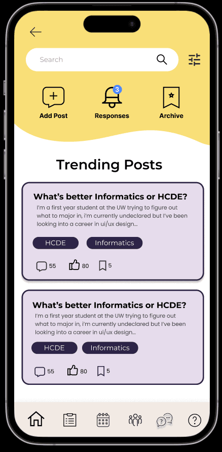
Currently, many students turn to Reddit for input on classes, or to ask questions. We noticed that any saved posts or responses on questions are not as intuitive to navigate on Reddit. We wanted to bring similar functionality to our Q&A forum while making the process smooth and easy to navigate.
Students often use LinkedIn to connect professionally with peers and folks in industry. However, there is a certain level of formality expected with LinkedIn that can make it intimidating for many students, especially underclassmen who are still figuring things out. We wanted our app to offer a networking platform that would be less formal so more genuine connections can be formed.


Information Architecture
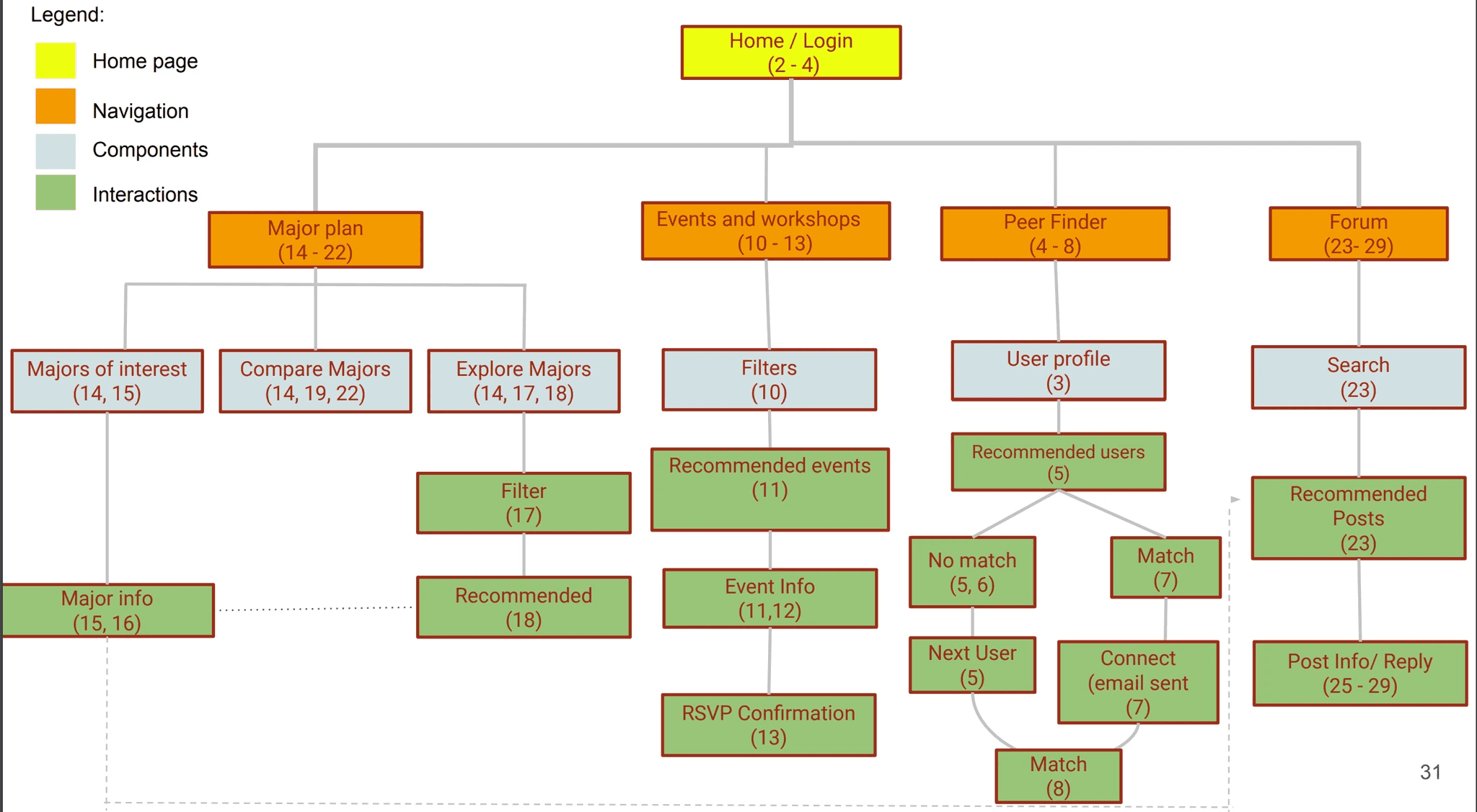
Once we established key features, we started mapping out the key components of the application to visualize the user flow. This helped us determine the functionalities of the application.
DESIGN SOLUTION
Low-fidelity Prototyping
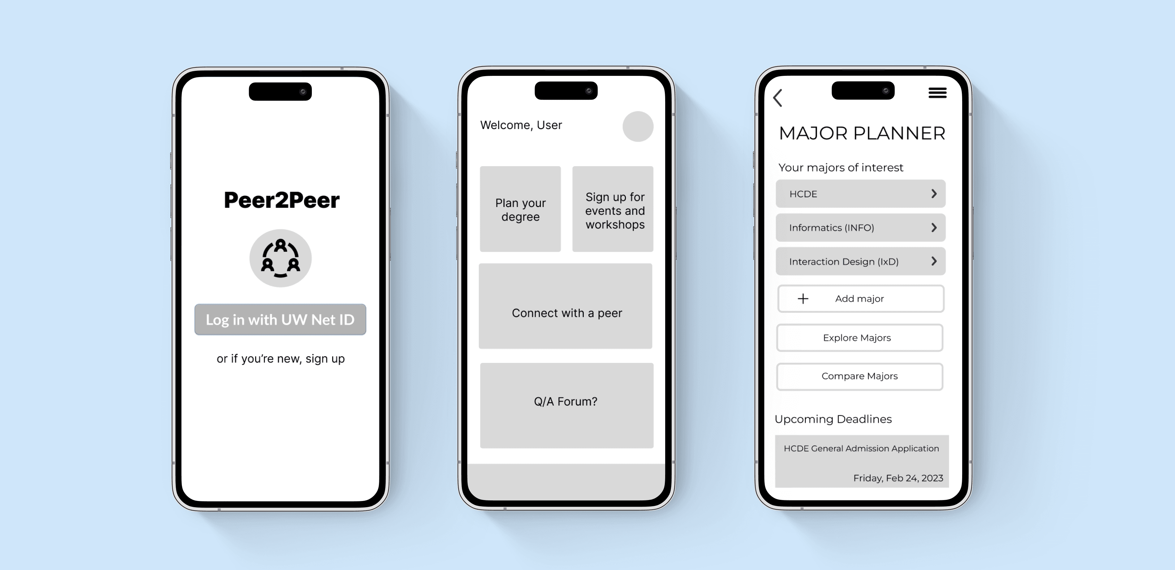
We started with creating low-fidelity wireframes to outline the layouts for the different pages. Our initial wireframes helped us determine ease of navigation and how to effectively share information.
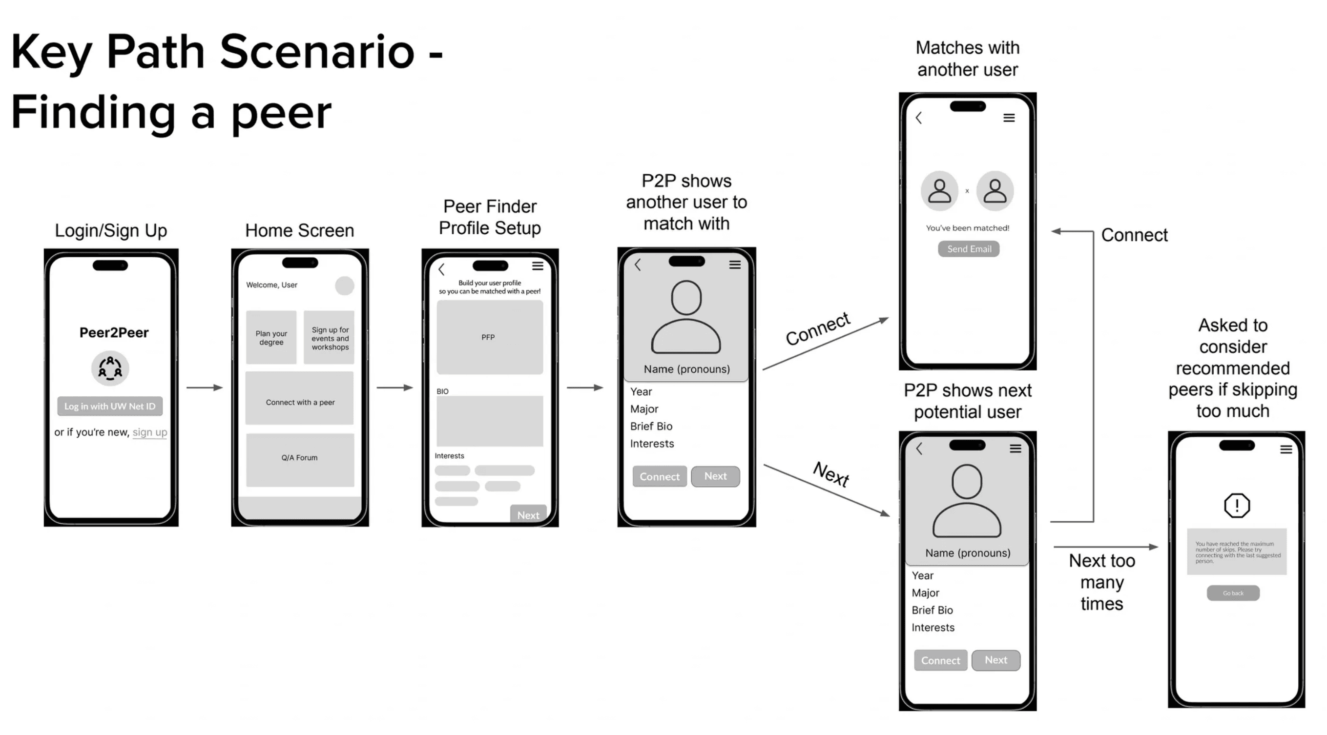
Key Path Scenario: Tracking the user flow through the low-fidelity wireframes. This helped us ensure a smooth user flow.
Once the low-fidelity prototype was created, I worked on the usability testing component by observing student interactions with the prototype. I interviewed a group of 6 individuals and asked them to think out loud as they navigated through the Peer2Peer prototype. This gave our team a better idea of what features were intuitive and what our shortcomings were. I learned that students really appreciated the filters option for events and workshops as that helped them narrow down the events and workshops to ones that they were specifically interested in.
Usability Testing
High-fidelity Prototype: Presenting Peer2Peer
After conducting usability testing with some students, we made some modifications on the navigation features of the design. Here's the final solution:
Try the Interactive Prototype
REFLECTION
I do wish that we got a chance to conduct more user interviews to learn more about the experiences of International students or Transfer students. Working with different groups for user research would have helped us even more in making the app design more inclusive for students with different academic experiences and backgrounds in relation to their college experience.
I also learned how to translate ideas into information architecture to create a smooth experience for the user. I've also realized that some features of this app would be better suited for a website instead (such as the major planner feature). It would be interesting to explore these ideas for a future iteration.
