Crafting Meaningful Visual Experiences
A rebranding of The Vera Project's visual platform 2023
10 weeks
Research
Design
Iteration
Reflection
Figma
Adobe
Project Timeline
Process
My role
Tools
Brand Audit
Client Research
Competitive Analysis
Graphic Design
Interface Design
The Vera Project is a non-profit organization based in Seattle, WA, that creates a space for youth and adults to gather and engage with art and music. Over the course of 8 weeks, I conducted client research and a brand audit to rebrand The Vera Project to improve their engagement with their audience. I designed a new brand logo, crafted a poster for a workshop, built an Instagram campaign, developed the mobile UI for their workshop registration, and curated a brand book for the organization.
Overview
Process
I studied The Vera Project's mission and goals of fostering personal and community transformation through collaborative, youth-driven engagement in music and art. I looked at the workshops they offered, and common themes of empowerment that their work focuses on. I started with mood boards and then dived deep into client research to understand their audiences and unique selling points.
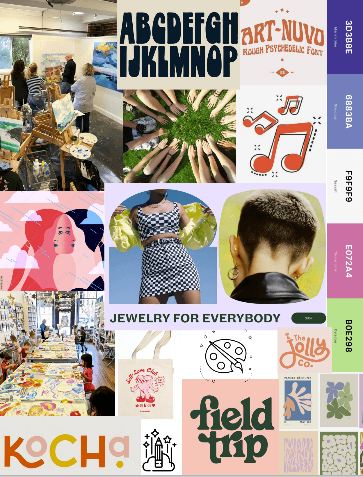
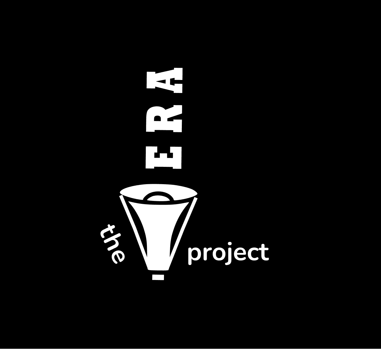
After creating a mood board, I began to reflect on key values that I wanted the redesign to incorporate. Since The Vera Project focuses on social change, I decided to use a megaphone in the logo to symbolize the organization's goals of amplifying voices. I also wanted the logo to be both playful and bold which is reflected in the type I used.
Redesigning The Logo
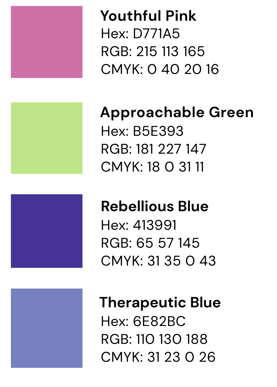
Creating a Type Hierarchy and brand colors
POSTER
MOBILE
Heading 3
Heading 2
Body
DM Sans Medium (40 px)
Heading 1
Archivo Black (305 px)
DM Sans Bold (50 px)
Archivo Black (230 px)
Heading 3
Body
Heading 1
Heading 2
Archivo Black (30 px)
DM Sans Medium (30 px)
DM Sans Regular (22 px)
Poppins (30 px)
MARKETING
Heading 1
Heading 2
Heading 3
Body
Archivo Black (40 px)
Archivo Black (30 px)
DM Sans Bold (30 px)
DM Sans Regular (22 px)
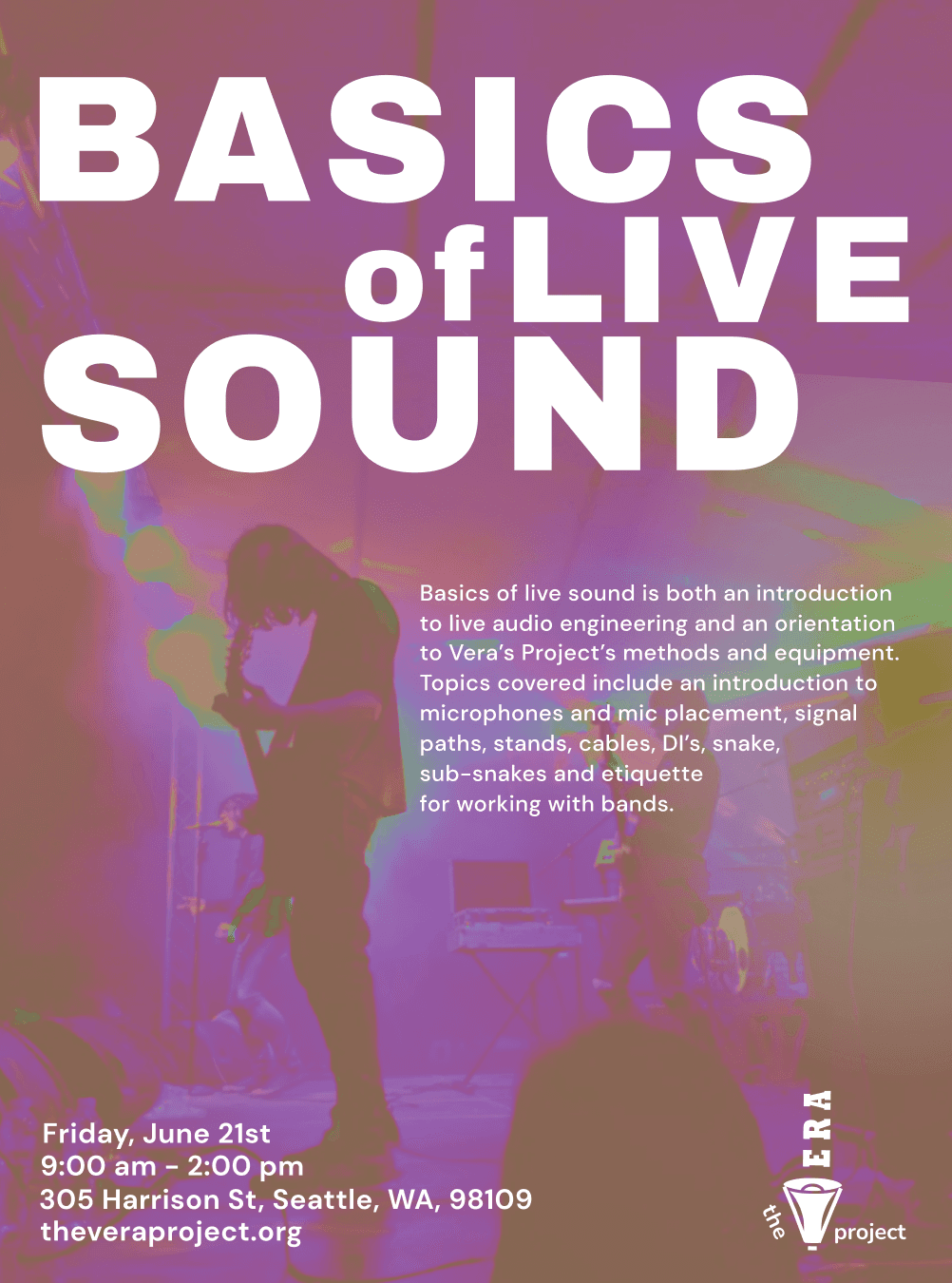
Basics of Live Sound was an event hosted by The Vera Project. I designed a poster for the event that incorporated the brand colors from the redesign. In my designs, I focused on concepts such as hierarchy, layout, and typography.
Graphic Design for The Vera Project
Crafting a seamless mobile event ticketing experience
Currently, if a user wants to purchase a ticket for an event hosted by The Vera Project, they have to navigate to the website. To buy a ticket for an event, the user is then taken to a third party site for purchasing the ticket.
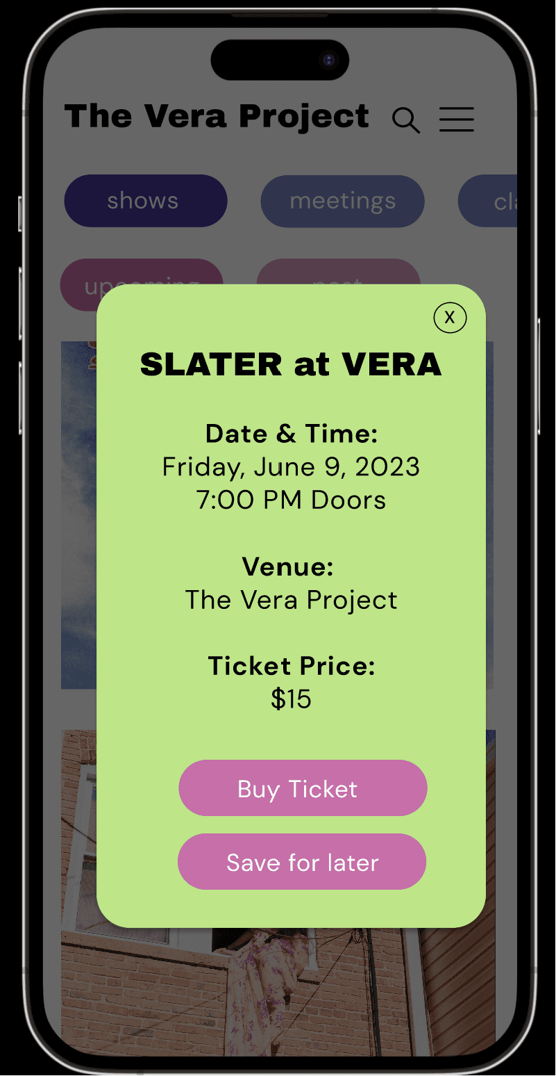
I wanted to create a smooth mobile experience that would allow the user to buy tickets for an event through an app for The Vera Project. To craft this experience, I first created a user journey map to understand the process of purchasing a ticket.

Sees a post on Instagram about a cool music show hosted by The Vera Project
Hopeful to spend a Friday evening at a local music show
Excited to see all the events offered by The Vera Project
Curious to explore all the options and register for an event
Confused about navigating a completely different website for the payment
Annoyed about having to make an account for purchasing a ticket
Opens The Vera Project website to learn more about event details
Searches for the event or browses through
Decides to purchase a ticket for the event
Immediately redirected to another website to purchase a ticket
Selects a payment method and quantity for tickets
Immediately told to create an account
Loses all progress about ticket order


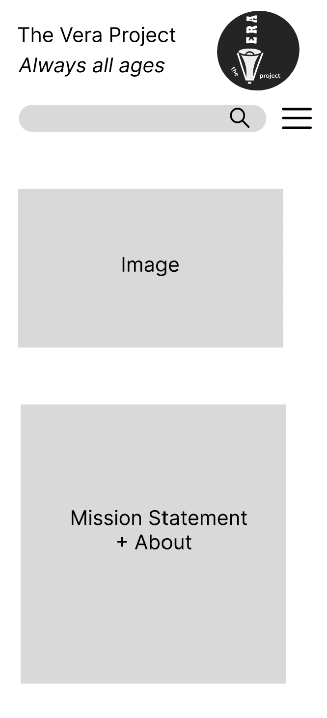
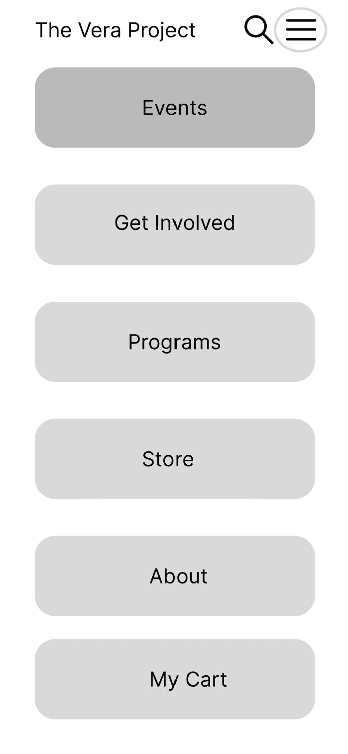
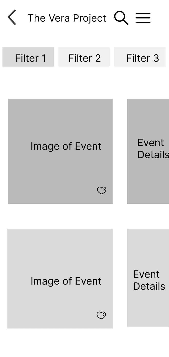
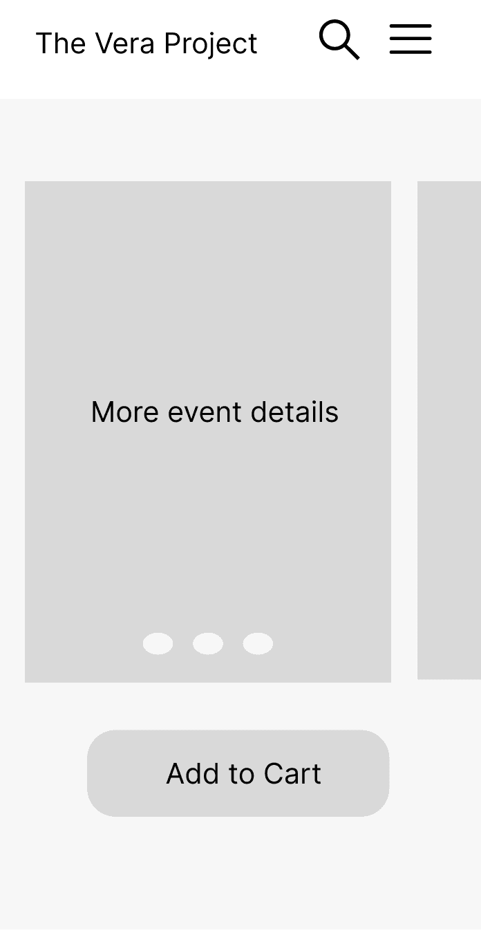
To address the key pain point of having to create another account on a different website, I began ideating with low-fidelity wireframes for a mobile app that improves ease of access for discovering events and purchasing tickets.
Initial Sketches and Low-Fidelity Wireframes
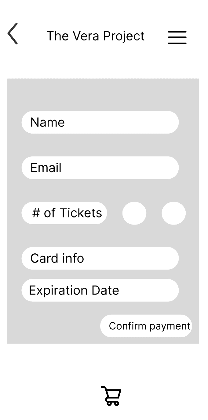
High-Fidelity Prototyping
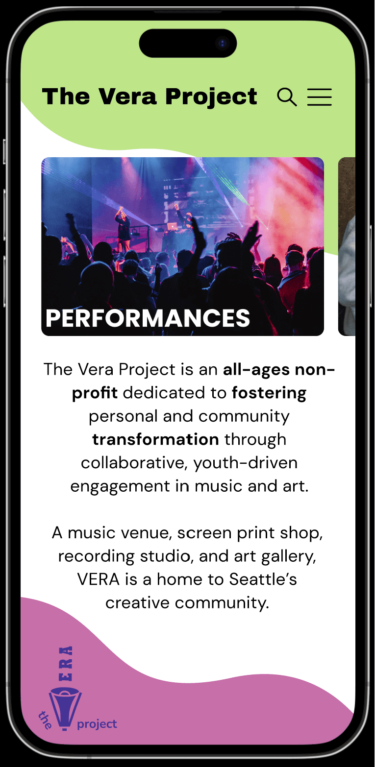
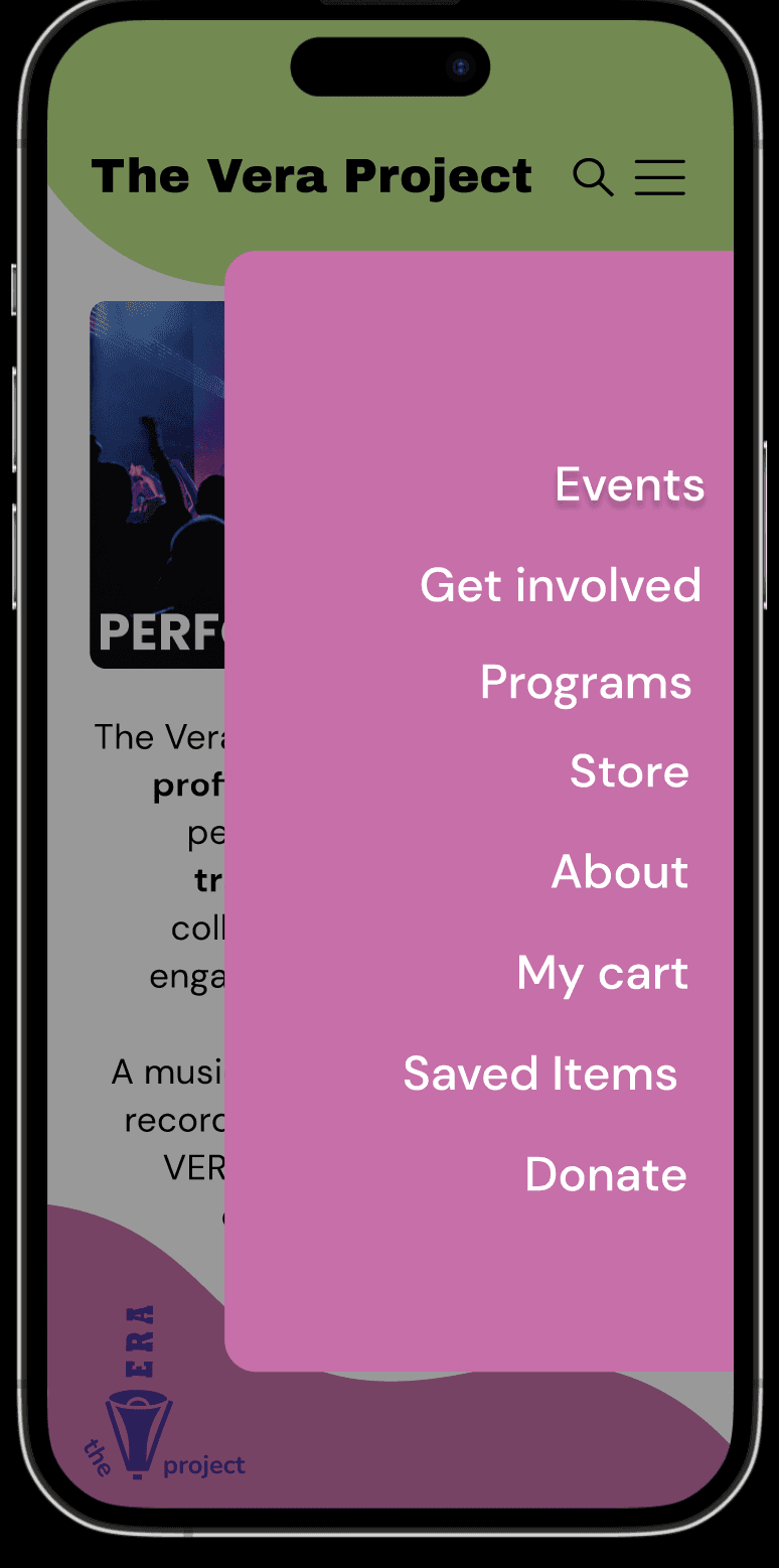
From the initial concept sketches, I moved on to the high-fidelity wireframes. I iterated on the navigation menu to make it more seamless and intuitive.
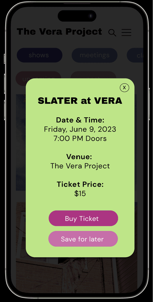
I also played with the redesigned brand colors and implemented a color version of the logo for the app screen. The visual design of the screen is intended to be youthful and engaging through the choice of colors. A key priority to me while designing was making sure that all features are accessible through color contrast, font choice, and intuitiveness while navigating.
I'm eager to continue iterating on this final design and hope to refine the checking out process for purchasing tickets for events.
Final Brand Book
I crafted a brand book compiling my designs throughout this project. The brand book reflects the brand identity that I wanted to highlight with the redesigns.
Try the Interactive Prototype
View the Brand Book here!
Reflection + Lessons Learned
Through this project, I got the chance to deeply think about the process of curating a brand. From an initial mood board, I explored different color sets and themes to craft a unique brand identity that would target a young audience. Conducting a brand audit also helped me keep the organization's mission and values in mind while designing.
I deeply enjoyed the process of iterating through redesigns of the logo - experimenting with different fonts, colors, and shapes. Combining each redesign of the visual elements with the interface design helped me see the design process holistically. I learned about how different elements need to come together to create interfaces.
For a future iteration, I hope to refine the mobile ticketing experience by incorporating a complete payment experience. I also hope to conduct usability testing with the mobile prototype to get feedback.


